Get Custom Window Blinds Cheap: Quality & Style
May 30, 2026
The Elegant Curtain Pull Wand: A Complete Guide for 2026
June 1, 2026
You're probably looking at a room that feels almost finished. The walls may already be painted, or you've narrowed your samples to a few beautiful blues. But something still feels unsettled. In Tampa homes, that usually comes down to light, fabric, and proportion. Blue can feel refined and calming, or heavy and flat, depending on what surrounds it.
That's why blue wall decor works best as a system, not a single purchase. The wall color, the trim, the drapery, the hardware, the art, and the daylight all speak to each other. In a Florida home with strong sun, humidity, and indoor-outdoor living, those choices need to be practical as well as elegant.
Selecting The Perfect Blue Foundation For Your Room
Blue is one of the oldest decorative colors in design history. It also has a luxury lineage. Natural ultramarine came from lapis lazuli mined in Afghanistan and remained one of the most brilliant blue pigments available through the Middle Ages, Renaissance, and early modern period. In the 1820s, synthetic ultramarine made that once-elite color far more accessible, and cobalt blue had already been invented in 1803, which helped move blue from rare symbolic use into everyday interiors and decoration, as noted by the National Gallery's history of blue pigments.
In practice, that history matters because blue still carries visual weight. It reads intentional. It doesn't disappear into a room the way some neutrals do.
Read The Light Before You Read The Paint Chip
In Tampa, I always start with the window exposure. A blue that looks crisp in a sunlit showroom can go dull in a north-facing room. A soft blue that feels airy in the morning can turn chalky by late afternoon if the room lacks warmth in its finishes.
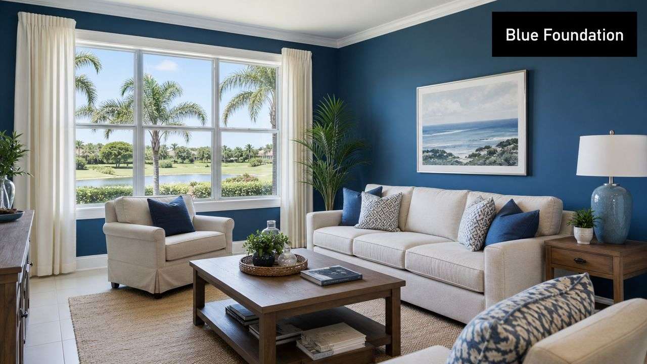
Consumer inspiration pages often skip this issue, but the practical problem is straightforward. Blue wall decor changes with room type and lighting conditions, and adjacent textiles and window coverings can make a blue accent read cooler, darker, or more muted, as discussed in this overview of how blue wall decor shifts with light and surrounding materials.
Practical rule: Never approve a blue based on one midday glance. Look at it in morning light, late afternoon light, and lamplight.
Match The Undertone To The Mood
A warm blue usually carries a touch of green, gray, or softness. A cool blue leans cleaner, icier, or sharper. Neither is better. The right one depends on the room's purpose.
Use this quick framework:
- For bedrooms: Choose softened blues that feel restful with linens, upholstered headboards, and filtered light.
- For studies or dining rooms: Darker blue can be excellent when you want enclosure and depth.
- For kitchens: Blue needs to work with cabinetry, countertops, and metal finishes. A related palette can help if you're weighing mixed tones. This gallery on blue and green kitchen combinations is useful for seeing how blue behaves beside other dominant surfaces.
- For foyers or stair halls: Mid-tone blue often gives enough personality without making transitional space feel narrow.
If you want more texture than paint alone can provide, patterned architectural surfaces can sharpen the scheme. I often like to study artisanal blue cement tile patterns when building a layered blue palette because they show how indigo, dusty blue, and blue-green can coexist without feeling repetitive.
Coordinating Architectural Details And Textiles
Blue walls look expensive when the surrounding architecture is handled with discipline. They look accidental when the trim, ceiling, and fabrics are left as an afterthought. The room needs contrast, relief, and touch.
Frame The Blue With Clean Architectural Moves
Start with the fixed elements. Trim can either sharpen the wall color or soften it.
A crisp painted trim gives blue walls definition. That's especially effective in homes with traditional casings, paneled openings, or detailed millwork. If the room is more contemporary, a quieter trim approach can feel more appropriate than high contrast. Ceiling color matters too. In a room with strong daylight, a lighter ceiling usually keeps the blue from pressing downward.
For windows with decorative architecture, structured top treatments can help the room feel finished. Properly scaled cornices for windows give blue rooms a stronger line at the top of the wall, which is useful when you want to connect trim, drapery hardware, and upholstery into one visual language.
The most polished blue rooms never rely on wall color alone. The casing, ceiling line, and window profile do half the work.
Build Warmth With Texture, Not More Color
Many homeowners try to “match” blue with more blue. That's usually where a room starts to flatten out. Texture is the better tool.
A successful blue room often mixes several tactile notes:
- Linen: Keeps the space relaxed and breathable, especially in coastal or transitional interiors.
- Velvet: Adds body and a richer light response, particularly in darker rooms.
- Bouclé or nubby weaves: Prevent smooth blue walls from feeling too slick or formal.
- Silk or silk-look accents: Useful in smaller doses for lampshades, pillows, or trimmed edges.
Don't forget the floor. Rugs with ivory, sand, tobacco, or muted gold usually help blue feel grounded. If every textile is cool-toned, the room can drift into a sterile mood very quickly.
Use Pattern As A Counterpoint
Blue wall decor doesn't need loud pattern, but it does need visual interruption. A room with solid blue walls, solid upholstery, and plain panels can feel unfinished even when the materials are expensive.
Consider a few controlled moves:
- A patterned chair or bench: Breaks up large blue fields.
- Bordered drapery panels: Introduce structure without noise.
- Striped or botanical pillows: Work well when the wall color is deep and uniform.
The goal isn't to fill the room. It's to keep the eye moving. In high-end interiors, restraint usually looks better than over-coordination.
The Art Of Dressing Windows In Blue Rooms
By two o'clock in a Tampa living room, the wall color that looked rich and balanced over morning coffee can turn sharp, washed out, or overly cool. In blue rooms, the window treatment controls that shift. It regulates glare, protects depth of color, and gives the room the finish that paint alone cannot provide.
A blue wall without a considered treatment at the window rarely feels complete.
Fabric Changes How Blue Reads
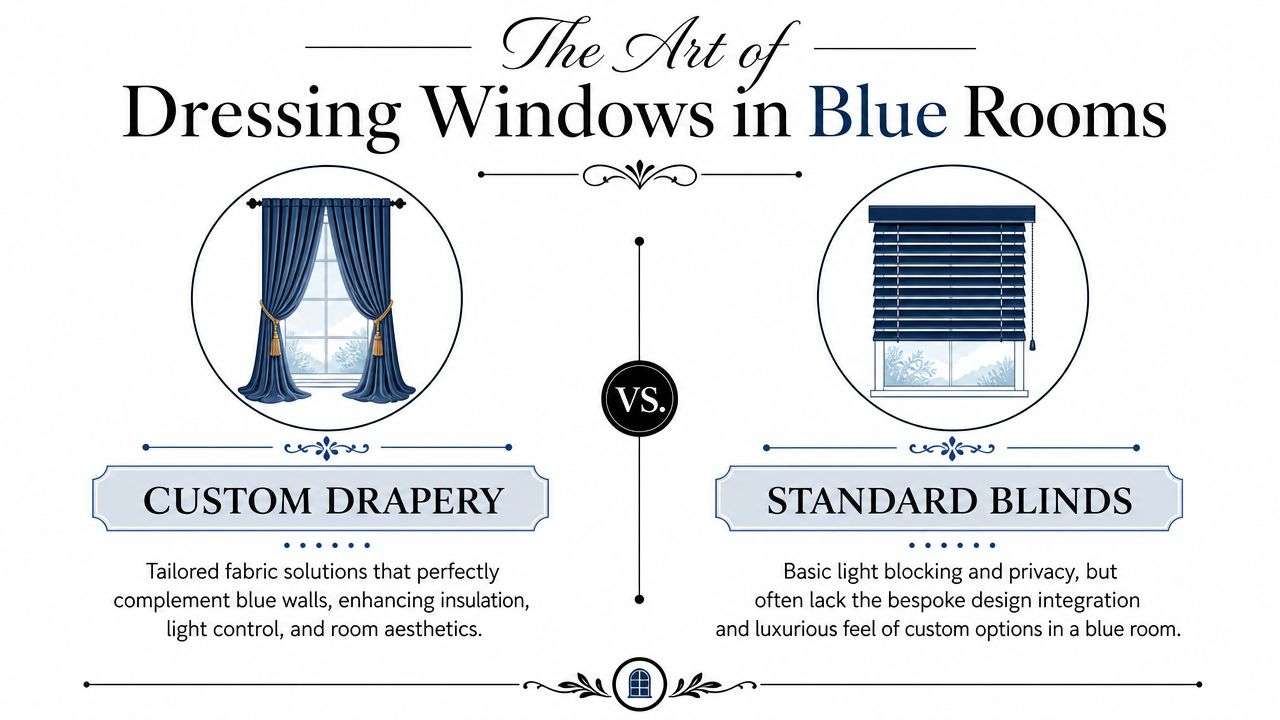
What sits against the glass changes the blue just as much as what sits on the wall. Sheers filter hard daylight and soften contrast. Lined drapery holds color steady through the brightest part of the day. Roman shades add order. Shutters introduce shadow lines that can work well in the right architecture, but they are not always the best answer for wide expanses of glass common in newer Tampa homes.
In quieter blue rooms, I usually prefer drapery that stays close in tone and changes the mood through weave, lining, and fullness. In deeper navy or slate rooms, contrast often gives the room its edge. Ochre, clay, tobacco, coral, ivory, and black can all work, but only if the room's light, trim color, and flooring support them.
If you are weighing treatment types, this guide on what drapery is and how it functions in a room gives a clear foundation before you choose fabric, hardware, or operation.
Custom Solves The Problems Standard Treatments Leave Behind
Ready-made blinds can provide privacy. They usually do not solve proportion, softness, insulation, and finish at the same time. Blue rooms make those misses obvious. A panel hung too low, a shade mounted without enough width, or a fabric chosen without lining can make an expensive room feel unfinished.
In practice, custom window treatments let you coordinate four decisions together:
- Scale: Panel width, stack back, hem break, and mounting height can be set to suit the ceiling and window size.
- Operation: Motorized shades, traversing drapery, and layered systems perform better on tall windows, sliders, and rooms used throughout the day.
- Light control: Sheer with blackout, or woven shade with side panels, gives better command over glare, privacy, and evening comfort.
- Finish level: Interlining, trim, pleat style, return depth, and hardware determine whether the room feels generic or bespoke.
The Drapery Company fabricates custom treatments onsite for residential and commercial interiors in the Tampa Bay area. That local production matters when a blue room calls for exact lengths, careful pattern placement, or a solution for arched windows, corner glass, or pocketing sliders.
A dramatic wall color paired with a generic window treatment almost always leaves the room unresolved.
What Works In Real Blue Rooms
In soft blue spaces, linen-look panels with enough weight to hang cleanly usually perform well in our climate. In moody blue rooms, velvet and heavier weaves can look beautiful, but they need proper lining, disciplined pleats, and enough wall height to carry the added volume. In open-plan homes, I often specify woven shades under drapery because that pairing gives daytime structure without losing softness at night.
Some combinations create problems fast:
- Underscaled panels: They shrink the window visually and make ceilings feel lower.
- Bright white mini blinds against saturated blue: The contrast reads builder-grade in most high-end interiors.
- Unlined fabric in strong sun: Light passes through unevenly and the color loses body.
- Ignoring stack back on doors: The treatment blocks glass and makes access awkward.
Windows also affect the walls around them. Once the treatment is in place, art placement tends to make more sense, especially if you are creating the perfect art display in a blue living room or bedroom.
The strongest blue interiors treat window treatments as part of the architecture, not as an afterthought. That is how the room holds its color, its comfort, and its polish from morning through evening.
Illuminating And Accessorizing Your Blue Space
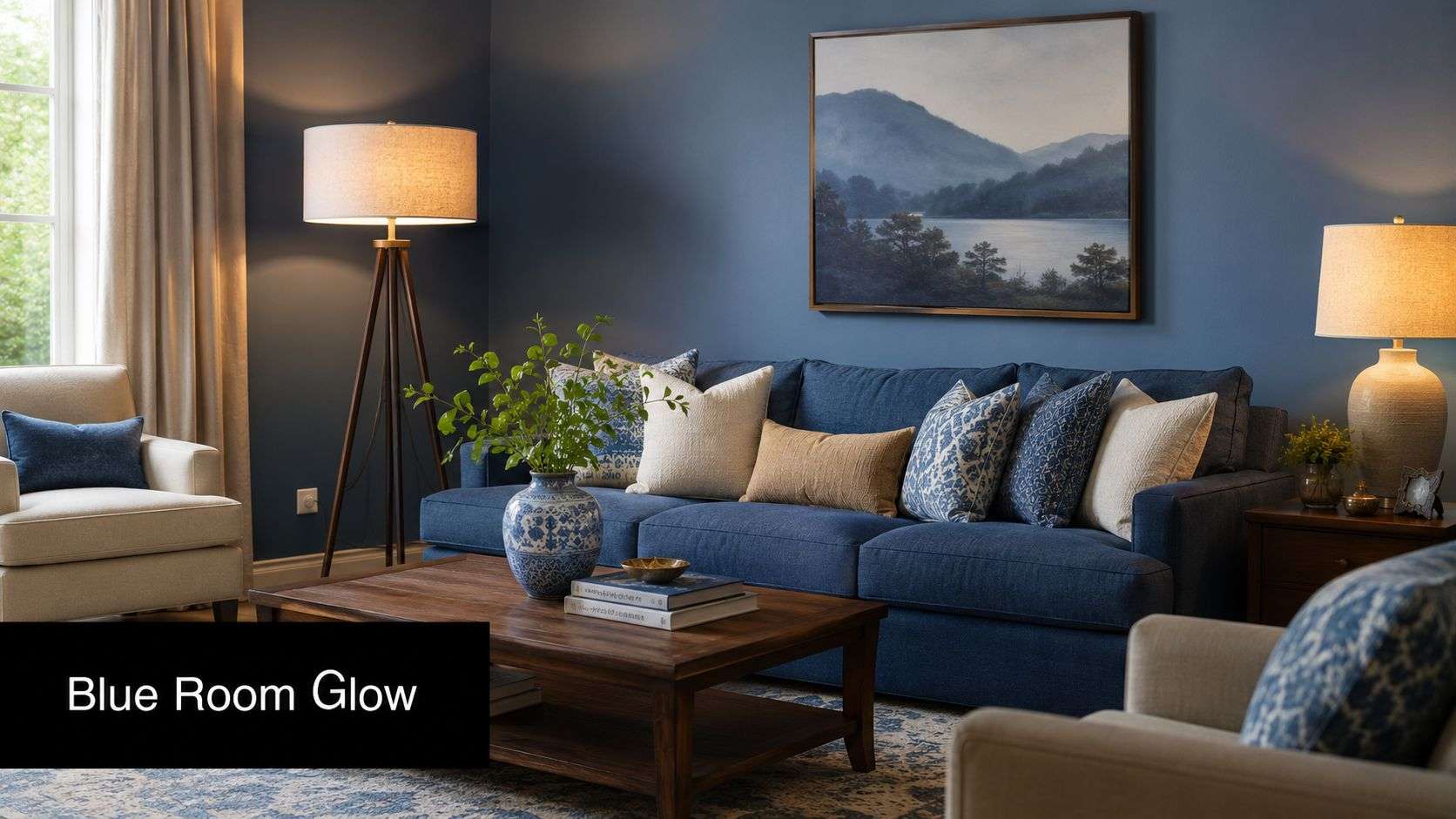
Blue changes dramatically once the sun goes down. A room that feels balanced at noon can feel flat or overly cool at night if the lighting hasn't been considered with the wall color in mind. That's where accessorizing becomes more than decoration. It becomes correction, emphasis, and mood control.
Layer The Light Instead Of Flooding The Room
One ceiling fixture won't do much for blue wall decor. Blue needs a layered lighting plan because it absorbs and reflects light differently through the day.
Use a mix of sources:
- Ambient light: The main room lighting that sets overall brightness.
- Task light: Reading lamps, desk lamps, and focused lighting near seating.
- Accent light: Picture lights, sconces, and small lamps that add glow to walls and objects.
Warm lighting usually flatters blue more than cold lighting does, especially in evening hours. It enriches the wall instead of making it feel steely. In rooms with strong daylight and privacy needs, lighting and window automation often work together. Motorized treatments such as electric curtain track systems can help you control glare and preserve the intended tone of the room across the day.
Use Art And Mirrors To Break The Blue Intelligently
Blue has a deep decorative history. The earliest evidence of Chinese blue-and-white ware dates to the Tang Dynasty (618–907), and the style matured in the early 14th century when cobalt imported from Iran supported mass production, as described in this piece on the history of blue-and-white decorative traditions. That legacy is one reason blue-and-white ceramics, framed textiles, and porcelain accents still feel so natural in blue rooms.
Mirrors are just as useful as art. In a darker blue room, a large mirror opposite or adjacent to a window can multiply available light and reduce the sense of visual heaviness. In a lighter room, a gallery wall can create rhythm where one long blue wall might otherwise feel blank.
If you're arranging multiple pieces, this guide to creating the perfect art display offers useful composition ideas that translate well to living rooms, hallways, and stair landings.
Here's a visual reference worth watching if you're refining the mood of a blue interior.
What To Choose For A Finished Look
A few accessories tend to work repeatedly in upscale blue spaces:
- Brass or aged metal fixtures: They warm the room without fighting the wall color.
- Blue-and-white ceramics: A classic move with historic roots.
- Natural materials: Wood, rattan, stone, leather, and plaster prevent blue from feeling too slick.
- Large-scale art: Better than scattering many tiny pieces across a strong wall color.
Blue rooms benefit from restraint. Fewer objects, better scaled, usually look more luxurious than many small decorative pieces.
Extending The Luxury To Your Outdoor Living Space
In Tampa Bay, a beautiful blue interior shouldn't stop at the sliding door. The lanai, covered terrace, outdoor kitchen, and poolside seating area are part of daily life for much of the year. If the inside is polished and the exterior is treated as an afterthought, the home loses continuity.

Bring The Blue Palette Outside With Intention
Outdoor drapery can carry the interior color story to the outdoors without making the space feel themed. A slate blue, marine blue, or softened coastal stripe can echo interior blue wall decor while still reading relaxed outdoors.
The practical requirement is performance. Tampa weather asks a lot from fabric. Sun, humidity, wind, and sudden rain will expose weak materials very quickly. Outdoor drapery needs fabric suited to those conditions, plus hardware and installation methods that can tolerate exposure.
Why Outdoor Drapery Earns Its Place
Outdoor drapery does more than decorate. It defines zones, softens hard architecture, filters low sun, and adds privacy around a seating or dining area. It can also make a covered patio feel more like a resort cabana than a leftover slab behind the house.
For outdoor living areas that also need sun management, outside mounted shades can pair well with drapery panels. The shades handle direct light and visibility. The fabric panels add movement, softness, and visual luxury.
What tends to work best outdoors:
- Simple panel designs: Easier to maintain and less fussy in breezy conditions.
- Colors with some depth: Pale tones can look washed out in hard daylight.
- Strong tiebacks or holdbacks: Necessary when panels need to stay controlled.
- Indoor-outdoor palette continuity: The patio should feel connected to the rooms beside it.
A well-designed outdoor drapery plan makes the house feel larger because the style language doesn't stop at the threshold.
Maintaining The Elegance Of Your Custom Design
A blue room can look flawless at installation and tired six months later if the finish materials are not maintained with the same discipline used in the design plan. In Tampa, heat, UV exposure, humidity, salt air near the water, and everyday use all leave a mark. High-end rooms keep their polish because the walls, drapery, hardware, and trims are checked before small issues turn into visible decline.
Protect The Walls And Decorative Surfaces
Blue paint shows wear in specific ways. Matte finishes tend to scuff. Higher-sheen finishes wipe down more easily, but patch repairs can flash under daylight, especially on saturated blues. Clean marks gently and only where needed. Aggressive scrubbing can burnish the surface and make one small scuff stand out even more.
Large-format wall decor needs the same level of scrutiny. With murals, framed panels, glass art, or specialty wall applications, the material, coating, and installation method matter as much as the design itself. In humid interiors such as bathrooms, entryways, and sunlit living spaces, weak adhesive choices and the wrong substrate often cause the failure first, not the artwork. Product specifications for large-format decorative wall applications are worth reviewing before installation and again if replacement becomes necessary.
Keep Drapery And Curtains Looking Precise Over Time
Window treatments usually show age before upholstery does. Sunlight can shift the color. Linings can dry out. Pleats relax, hems drop, and brackets loosen slightly over time. In homes with sliders, pets, or children, the leading edge of a panel often wears first because it gets handled every day.
That loss of definition changes the room quickly.
A drapery panel that drags, twists, or pulls out of line interrupts the whole composition, especially in blue interiors where crisp contrast and clean vertical lines do a lot of the visual work. Professional drapery repair and curtain repair can correct loose pleats, damaged lining, stressed seams, bent pins, and failing hooks before full replacement is necessary.
Hemming matters just as much. Floor-length drapery should either meet the floor cleanly or break with intention. Anything in between reads like an error. I see this often after new flooring goes in or furniture placement changes. The fabric may still be beautiful, but if the length is off by even a small amount, the room loses its finished look.
Care For Outdoor Treatments Before They Fail
Outdoor panels around lanais and covered patios need regular inspection in Tampa. Wind, moisture, mildew pressure, and afternoon sun are hard on hems, thread, grommets, brackets, and tiebacks. Waiting until fabric tears or hardware pulls loose usually turns a repair into a replacement.
A simple maintenance routine works well:
- Seasonal inspection: Check hems, rings, brackets, holdbacks, and rod alignment.
- Light cleaning: Remove dust, pollen, and surface buildup before they settle into the fabric.
- Early repairs: Fix one loose pleat, stressed seam, or worn edge before the damage spreads.
- Professional reworking: Re-hem, rehang, or adjust panels once they stop falling correctly.
Blue rooms feel expensive when the lines stay clean. Maintenance protects those lines as much as it protects the material.
If you're refining a blue room or planning a whole-home palette, The Drapery Company can help coordinate custom window treatments, outdoor drapery, repair work, and hemming so the finished space stays cohesive, functional, and polished for Tampa living.